OLDER >
< NEWER
Another chance to work with elevin elevin.
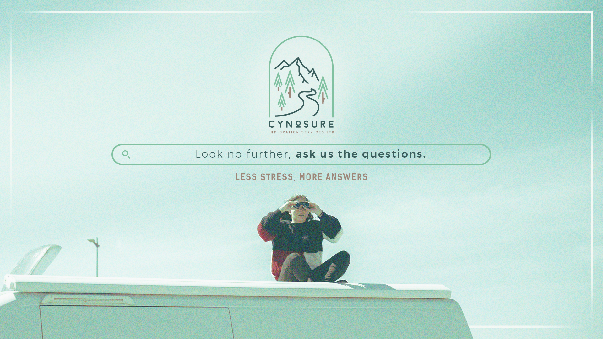
This time was for Cynosure, an Immigration Consultation Firm based in Canada.
The project started from an illustration logo in watercolours that the client already had. It was very cute but it was not benefiting the brand at all - aside from the problems that we already know using an illustration as a logo can cause, our client had an attachment to the image and what it represents, and there were some insights, ideas, feelings and even personality that they didn't want to loose.
So my job was to select and translate the concepts to a more attractive and competitive place.
![]()
In the process, the name of the organisation had to be changed for legal reasons out of our control, and the new name was Cynosure.
The main challenge was that we wanted to preserve the most of the previous logo that we could, so it was just a matter of exploration about where and when. For the logo we decided that we were going to focus more on the nature and a path to follow, so I started to explore different styles and how to communicate it through colours, shapes and typography.
These are the three main digital sketches that we decided from:
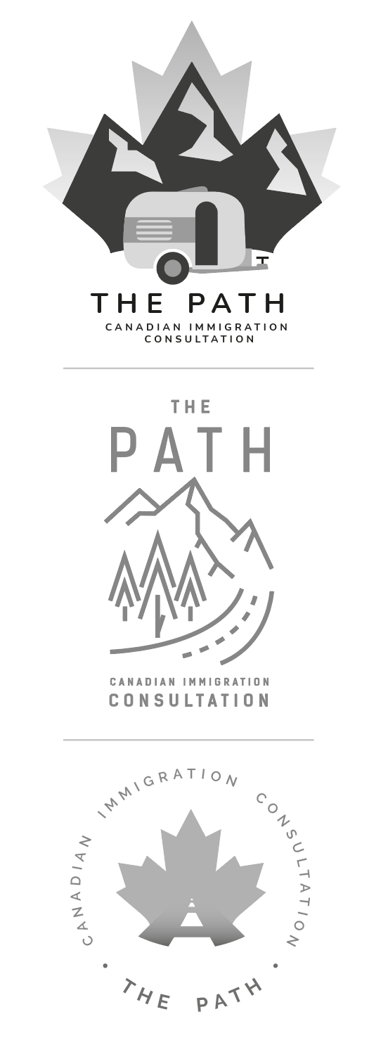
And after showing this to the client... we got a yes!
This composition is mainly inspired by landscapes of an art gallery but presented in the minimal way to create the logo. The frame of a window implies the view of what is next to come.
In this project I delivered:
- The logo with some composition variants
- Key visual / Filter
- Colour Palette
- Selection of Typography
- Guidelines
- Favicons